

From intention to impact: Designing emotion into luxury packaging
Vincent Villéger reflects on the growing role of intentionality in luxury packaging design, and how precision, psychology, and brand clarity are shaping a more considered creative landscape.
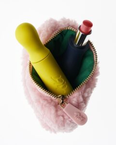
Stylish, modern and accessible. Inclusive design is a smart commercial decision
What use is packaging if it alienates a big portion of users? As some of the most forward-thinking brands in beauty, tech and beyond are discovering, designing with empathy and accessibility front of mind isn’t a constraint, but a competitive edge. Casey McHugh, Conference & Community Manager at Easyfairs, explains why.