

A good packaging design is one of the most compelling factors in a business’s growth. Attractive packaging designs that trigger the right emotions in the minds of your customers are the key to effectively motivating your consumer’s purchasing decisions. It sets the wheels in motion.
But all of this is contingent on the same eye–hand coordination that is fundamental to learning how the brain produces internal models of the activity space and induces movement within it. It is at the heart of our everyday acts and experiences with objects and people around us. And it is at the heart of what we choose to purchase.
Mass marketing, or the casting of a proverbial net far and wide, still has tremendous appeal to advertisers, big and small. The appeal of millions of eyeballs appears timeless, even if brands have no idea who they belong to.
Humans are visual learners. Although most people have five working senses, they aren’t used equally; with a third of the human brain’s cortex dedicated exclusively to vision, these visual elements automatically have a heavier influence on your perceptions.
It’s quite fascinating, but what does it have to do with retailing and marketing? The answer, quite simply, is everything. The saying “We eat with our eyes first” can easily be said another way: We consume with our eyes first. What we consume, as potential purchasers of a product, is information.
Eye level is buy level
Developing packaging can be an expensive process. But when you consider the thousands of products on store shelves and that eye-catching packaging design is the only on-the-spot tool that you have to encourage sales, it is money well spent.
Most shoppers aim to spend as little as possible, while the main objective of supermarkets is to encourage us to spend as much money as possible. But what makes certain pack designs catch the eye while consumers pass other products by?

Packaging, one of the last vehicles for brand messaging consumers see before purchasing, is critical in motivating shopper behaviour. Seeing your packaging through the eyes of consumers is an important exercise toward designing a functional, attractive, and effective design that drives sales and influences shopper behaviour.
When you are so familiar with your packaging design and haven’t considered it from the perspective of a new customer in a while, it may be difficult to identify what stands out. That’s where it pays to involve those immersed in the packaging design world. London’s vibrant home for packaging innovation and design will walk you through that immersive process, where the right materials and shapes are matched to the desired sensory cues that trigger a positive response in the consumer’s mind. From material research to manufacturing and finishing processes, the two-day, four-sector showpiece events are designed to help luxury brand owners leverage the potential that materials have to fine-tune the perceived value of the packaging design and, therefore, the brand.
The first bite is with the eyes
Colour can be extremely effective at grabbing our focus. Certain colour wavelengths have been shown to attract human attention. Shape, too, has the potential to be the single most unique identifier for your product packaging.
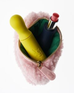
Your pack design should clearly and effectively show the product contained within. If a consumer looks at your packaging and cannot identify what you’re selling, they are likely to walk on by. And that goes for an honest depiction of what you’re selling too!
In a perfect world, everyone who sees your packaging would be motivated to pick it up and take it home. For that reason, you must take touch or haptics into account when planning your design. The aim is to create positive tactile experiences for consumers, layering features into your brand packaging to remove barriers to sale.
Your brand messaging should be streamlined so customers can scan the pack and immediately understand the key takeaway of your product. And don’t overlook the importance of font choice in your design – it is key to delivering your literal message and should align with your overall aesthetic.

Packaging helps customers form a clear connection with your brand. It enables them to envision how using your product will impact their lives. And for brand owners, packaging design must interrupt consumers on autopilot.
If this is overdone, you risk overloading the consumer. When there’s too much going on, whether in the design or the copy, consumers won’t know where to look, and they’ll switch off. This can also apply to the fonts used; simplicity is key.
Crave appeal
Does this product look good to me as a potential buyer? Is how it is packaged, presented, and displayed attractive to me as a potential buyer? These are the questions we process when we see a product for sale.
The Roman gourmet Apicius famously stated two thousand years ago, “We eat first with our eyes.” He was one of the first people to realise that the appeal of a dish is not just a matter of what goes into our mouths. Much of our experience is set by our expectations.
Visual stimuli can come in shapes, sizes, colours, and designs. While no one can know what specific style and design will appeal to every person on the planet, we do know the general outline of what will make a good visual.
In what ways is your product packaging visually distinct from your competitors? Outside of your logo, do your customers associate you with a specific visual feature, such as a colour?
Our job as brands and producers is to drive that desire to satisfy. To create a literal hunger and trigger a primordial desire for the product.
To do this, creating something visually distinct that elevates the senses and taps into visual appetite appeal is the way to go.

While there is no doubt that we have a captive audience, we don’t have long to land our message. A huge part of that is conjuring a unique sensorial consumption moment – allowing people to taste a product without even taking a bite. Think KFC and ‘Finger-lickin’ chicken, the distinctive sound of a chocolate-cracking bite of a magnum, Lurpak butter sizzling in a hot pan.
The appeal of a pack has the potential to trigger impulsive buying even for consumers with no intention to make a purchase. Your packaging design should speak loudly and clearly for your product.
In the ever-evolving world of retail supermarket packaging, juggling demands such as the importance of clear messaging, value perception, and environmental considerations should be undertaken alongside creating something that is a feast for the eyes from the get-go. And what better way to do that than hearing about the hard and fasting learnings from people who’ve done it at London Packaging Week?
Registrations for attendees are now open, and you can secure your place at this must-visit event by visiting www.londonpackagingweek.com today.

From intention to impact: Designing emotion into luxury packaging
Vincent Villéger reflects on the growing role of intentionality in luxury packaging design, and how precision, psychology, and brand clarity are shaping a more considered creative landscape.
Stylish, modern and accessible. Inclusive design is a smart commercial decision
What use is packaging if it alienates a big portion of users? As some of the most forward-thinking brands in beauty, tech and beyond are discovering, designing with empathy and accessibility front of mind isn’t a constraint, but a competitive edge. Casey McHugh, Conference & Community Manager at Easyfairs, explains why.